Latest Blog Posts


Beyond the Ink: How Paper, Subtractive Color, and Substrate Tint Impact G7 Compliance
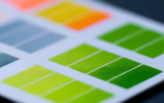
In digital design, color is additive—glowing RGB pixels project light straight into the viewer’s eyes. On the press floor, however, the physics completely flip. Commercial printing relies entirely on the subtractive color model, where [...]
The Pantone Revelation: What Pantone Is, What It Isn’t, and Why Brand Color is Broken
In the commercial print industry, few terms carry as much unearned mystique—or cause as many expensive pressroom disputes—as spot color. When a brand manager or packaging designer specifies a spot color, they believe they [...]
Beyond the Ink: How Paper, Subtractive Color, and Substrate Tint Impact G7 Compliance
In digital design, color is additive—glowing RGB pixels project light straight into the viewer’s eyes. On the press floor, however, the physics completely flip. Commercial printing relies entirely on the subtractive color model, where [...]
The Pantone Revelation: What Pantone Is, What It Isn’t, and Why Brand Color is Broken
In the commercial print industry, few terms carry as much unearned mystique—or cause as many expensive pressroom disputes—as spot color. When a brand manager or packaging designer specifies a spot color, they believe they [...]
Mastering Spot Color Reproduction, Spectral Matching, and Brand Colors
When a corporate client sends over a brand identity package, the expectation is absolute consistency. Whether that signature royal blue or corporate orange appears on a glossy carton, a corrugated shipper, or a fine [...]
Optimizing Ink Limits, DeviceLink Profiles, and Total Area Coverage
In our previous article, we examined how G7 calibration and ICC rendering intents interact inside a Digital Front End (DFE) to maintain predictable neutral gray balance across press runs. However, even the most rigorously [...]
G7 Calibration and ICC Rendering Intents
When running high-end digital inkjet presses or offset lines, generating accurate ICC profiles is only half the battle. The true test of a commercial print operation is how those profiles interact with your Digital [...]
Cracking the Code on Rendering Intents: A Practical Guide
If you manage prepress workflows or send high-volume files to a commercial print facility, you have likely pulled a production sample from the finishing line and found a muddy graphic or an unexpected color [...]
The Fundamentals of Color Management: Light, Object, and Observer
Achieving consistent, repeatable color across a commercial print facility or industrial manufacturing line requires mastering the three foundational pillars of color science: the light source, the object, and the observer. Without controlling these core [...]
Understanding CIELAB: The Universal Language of Color Measurement
In commercial print and manufacturing, visual evaluations are frequently compromised by observer fatigue, environmental variables, and subjective opinions. To eliminate ambiguity, quality control teams rely on an objective, device-independent color model defined by the [...]
The Science of Color Perception: Why We Never See Color the Same Way
Color is frequently treated as a fixed, physical characteristic inherent to an object—a belief that a product simply "has" a specific color. In reality, color is a sensory experience generated dynamically by the human visual [...]