Beyond the Ink: How Paper, Subtractive Color, and Substrate Tint Impact G7 Compliance
Beyond the Ink: How Paper, Subtractive Color, and Substrate Tint Impact G7 Compliance
In digital design, color is additive—glowing RGB pixels project light straight into the viewer’s eyes. On the press floor, however, the physics completely flip. Commercial printing relies entirely on the subtractive color model, where physical inks absorb specific wavelengths of white light and reflect others back to the observer.
Unlike opaque paint, printing inks are generally translucent and semi-opaque. When cyan, magenta, yellow, and black (CMYK) are laid down on a press sheet, they do not block light like a solid wall; instead, they act as microscopic optical filters:
-
Cyan absorbs red light and reflects green and blue.
-
Magenta absorbs green light and reflects red and blue.
-
Yellow absorbs blue light and reflects red and green.
Because these ink films are semi-opaque and translucent, incoming light does not just bounce off the surface. Light passes straight through the translucent ink layers, strikes the underlying paper substrate, and travels back through the ink layers a second time before reaching the human eye. This means every color you see results from light being subtracted twice through a transparent colored filter while interacting directly with the paper beneath it.
How Paper Substrate Controls the Subtractive Equation
Because print inks are translucent, paper is never a passive background—it is an active and major partner in the subtractive equation. The physical characteristics of the stock dictate how much light survives this double-pass filtering process:
-
Brightness and Whiteness: A high-brightness sheet reflects maximum light back through the ink layers, producing a brilliant dynamic range and clean highlights. A duller or recycled sheet absorbs ambient light early, compressing contrast.
-
Optical Brightening Agents (OBAs): Many modern sheets use chemical OBAs to absorb invisible ultraviolet light and re-emit it as visible blue light, artificially boosting the sheet’s apparent brightness.
-
Surface Scattering: Gloss stocks reflect light smoothly, saturating color appearance. Matte and uncoated stocks scatter light in all directions, diffusing the light path and softening the perceived ink density.
The Impact on G7 Compliance and Calibration
This translucent, subtractive interaction creates unique challenges for G7 calibration and neutral gray balancing:
-
The Shifting Neutral Axis: G7 methodology aligns neutral print density curves (NPDC) based on the specific paper white of the stock being run. If you switch from a bright OBA-laden gloss sheet to a warm, unbleached kraft stock, the base reflectance changes completely.
-
The Translucency Variable: Because process inks are semi-opaque, variations in ink film thickness (dot gain) alter how much light reaches the paper. If press conditions drift, the filtering depth changes, causing neutral grays to skew off-axis.
-
Measurement Conditions: When evaluating translucent ink layers on OBA papers, measuring under the wrong light source (like M0 instead of M1) misses the paper’s true UV fluorescence, resulting in a G7 verification pass that looks visually mismatched in a D50 viewing booth.
Controlling the Substrate Variable
Controlling pressroom color requires treating translucent inks and paper substrates as a single optical system. To maintain G7 consistency across shifting paper inventories:
-
Measure Paper White First: Record the L*a*b* coordinates of every new paper lot before running G7 verification sweeps. Ensure your profiling software accounts for and adjusts for this.
- Profile by Substrate Family: Never reuse a profile built for a coated gloss sheet on an uncoated offset stock.
-
Use the Correct Measurement Mode: Always apply M1 measurement modes when evaluating OBA-enhanced stocks to capture true fluorescence and prevent visual shifts under ISO 3664 D50 viewing booths.
Deep Dive: Mastering the Substrate Variable in G7 Calibration
While digital screens operate on additive light (RGB pixels firing directly into the eye), the pressroom operates on a subtractive physics engine. Ink films are microscopic, translucent color filters. When ambient light strikes a printed sheet, it embarks on a round-trip journey: it passes downward through the ink layer, strikes the physical paper substrate, bounces back up, and passes through the ink layer a second time before hitting the observer’s retina.
1. The Anatomy of a Mismatch: When Substrates Defy Standard Profiles
The G7 methodology is a revolutionary way to achieve visual consistency by neutralizing gray balance and managing tonality (Neutral Print Density Curves, or NPDCs). It acts as a universal equalizer across various printing technologies. However, G7 relies heavily on standardized reference print conditions (such as ISO 12647-2 for offset or ISO 15339 / CGATS 21 datasets).
These standards assume a specific, idealized paper white (typically a neutral, moderately brightened sheet). But what happens when reality intervenes?
-
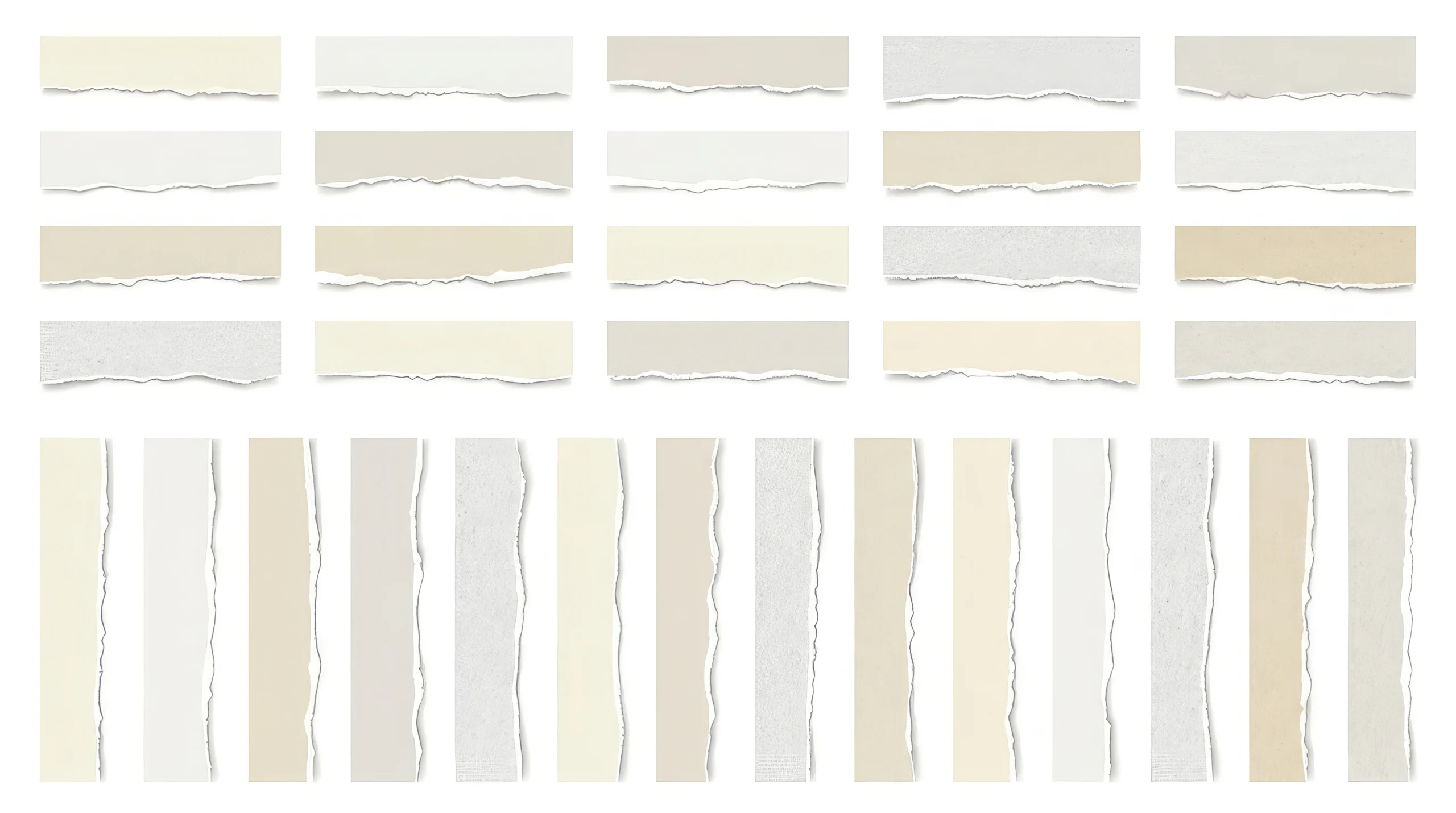
The Warm/Recycled Shift: If you swap an idealized grade-1 coated sheet for a warm, unbleached kraft stock or a high-post-consumer-waste (PCW) recycled sheet, the paper base has a natural yellow, brown, or grey cast (L*a*b* coordinates shifted away from D50 targets). Because G7 builds its neutral scale relative to the paper white, a stock with a heavy inherent tint will skew the neutral axis. Your “grays” will inherit the warm cast of the paper, violating visual neutrality.
-
The OBA Factor (Optical Brightening Agents): Modern paper mills flood sheets with chemical OBAs to make paper “whiter than white” by absorbing invisible UV light and re-emitting it as blue light. If your prepress workflow doesn’t account for OBAs, your spectrophotometer will read the sheet one way under shop-floor lighting, but the prints will shift dramatically when viewed under standard ISO 3664 D50 viewing booths.
2. The Solution: Leveraging SCCA (Substrate-Corrected Colorimetric Aims)
Because printers rarely run jobs on the exact paper specs defined in legacy datasets, IDEAlliance and color scientists introduced a vital tool for modern workflows: SCCA (Substrate-Corrected Colorimetric Aims).
SCCA is a mathematical breakthrough designed to solve the “paper color problem”. Instead of forcing a press to chase an impossible absolute standard when using an out-of-spec or specialty stock, SCCA allows the workflow or measurement device to recalculate the target aims on the fly.
-
How it works: Before running a G7 verification or calibration sweep, the operator measures the exact L*a*b* values of the blank unprinted substrate.
-
The Recalculation: Using the SCCA formula, the software or modern spectrophotometer recalculates the dataset’s aim points, scaling the target values to harmonize with the actual tint and brightness of the paper currently loaded on the press.
-
The Result: You achieve a valid G7 compliance pass that looks correct relative to that specific paper, ensuring brand colors retain their intended visual contrast and appearance even on non-standard stocks.
3. Best Practices for the Pressroom Floor
-
Mandatory M1 Measurement Modes: Never measure OBA-laden stocks using legacy M0 or M2 settings. Always utilize M1 (UV-included) measurement conditions to ensure your instrument captures the exact fluorescent energy of the optical brighteners, matching what human eyes see under a D50 light booth.
-
Substrate-Specific Profiling Families: Do not cross-pollinate ICC profiles or G7 calibration curves across wildly different paper families. Keep distinct curves and targets for coated gloss, matte, uncoated offset, and recycled/board stocks.
-
Audit Paper Lots Dynamically: Paper mills experience batch-to-batch variations in whiteness and brightness. For high-end packaging or long-run commercial work, spot-check incoming paper lots and use SCCA tools to tweak aim points before the first sheet goes through the press.