The Pantone Revelation: What Pantone Is, What It Isn’t, and Why Brand Color is Broken

Pantone Color Matching Commercial Printing CompanyQuick Reliable Printing (QRP)

The Pantone Revelation: What Pantone Is, What It Isn’t, and Why Brand Color is Broken
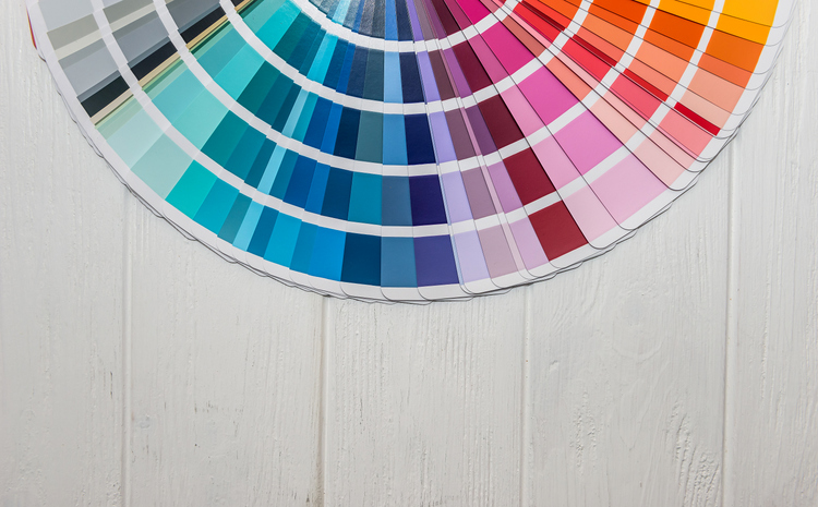
In the commercial print industry, few terms carry as much unearned mystique—or cause as many expensive pressroom disputes—as spot color.
When a brand manager or packaging designer specifies a spot color, they believe they are invoking an absolute physical law: a standardized, bulletproof guarantee that their corporate identity will look identical whether it is printed on a glossy carton in Ohio, a flexo flexible bag, or a corrugated shipper.
The reality on the press floor is far messier. To achieve true color predictability, prepress professionals must look past marketing mythology, understand what spot colors actually are (and aren’t), and recognize that Pantone colors and their formulas are merely a snapshot of a specific press, a specific calibration, a specific paper, at a single moment in time—never intended to serve as a universal master formula.

The Pantone Revelation: What Guides Are (and What They Aren’t)

For decades, Pantone has been the undisputed authority on spot colors. Designers flip through physical swatch books, find a crisp hue, and specify it for production. However, official Pantone guidance reveals a surprising reality that catches many print buyers and designers off guard: physical Pantone Guides aren’t what most people think they are.

What Pantone Guides ARE:

  • Useful in design for color inspiration: They provide a tactile palette to spark creative direction during the initial conceptual phase.

  • A quick reference for color visualization: They offer a fast way to preview how a general hue family looks on paper loosely.

  • Recognized globally for color communication: They give the supply chain a shared numerical naming convention so everyone talks about the same named hue.

What Pantone Guides ARE NOT:

  • ARE NOT: The master standard. The physical ink swatch or formula in your hand is not an absolute law. The exact same ink formulation will look completely different on every press, under different press calibrations, on alternate paper stocks, and across fluctuating lighting environments.

  • ARE NOT: Constant in their Delta E (ΔE) values. Physical guides age, fade, and vary significantly from print run to print run, meaning their actual colorimetric values drift away from their intended math.

  • ARE NOT: Consistent with each other. If you compare an older fan guide to a freshly minted one, you will often find noticeable color discrepancies. If you compare ten different guides, you will get ten different visual results.
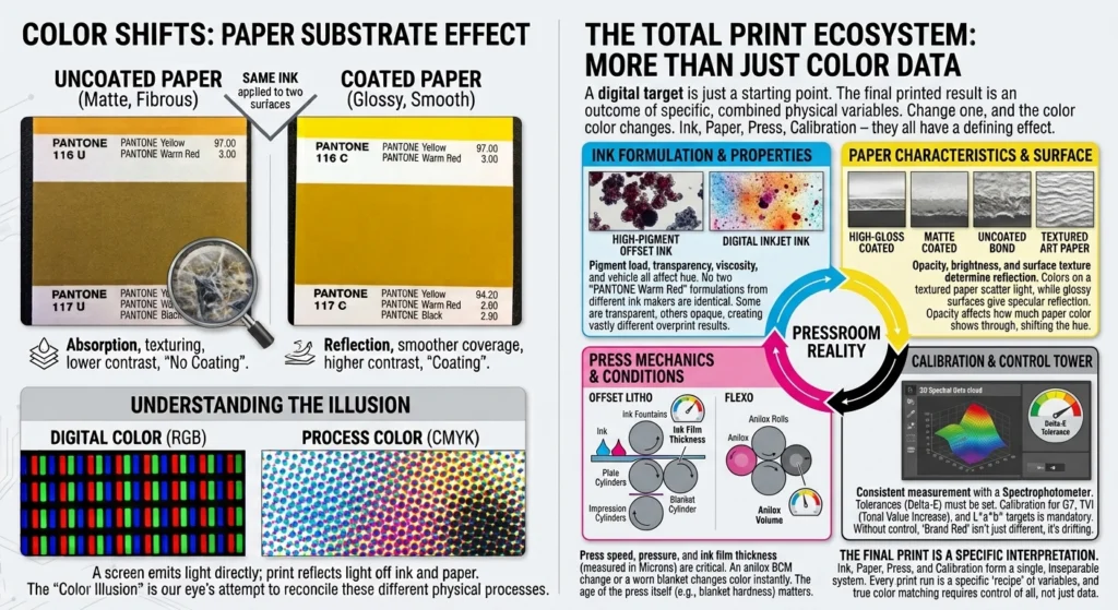
This creates a dangerous disconnect: a designer picks a color from a physical book that may have drifted, while the press operator is expected to hit a digital CxF spectral target. Not only that, but the formula listed is only valid for that specific paper, press, calibration, and run, on that day, with that ink, that humidity, etc.

Infographic comparing uncoated vs coated paper color shifts with Pantone swatches, plus a diagram of the print ecosystem.Quick Reliable Printing (QRP)Quick Reliable Printing (QRP)

Beyond Spot Colors: The CMYK Translation Challenge and Color Bridge

While Pantone is famous for its proprietary spot inks, modern design and packaging workflows rely heavily on CMYK four-color process printing for cost and efficiency. This introduces a major translation gap because a spot ink and a CMYK build approach color from completely different directions.
  • The Gamut Limitation: Pantone spot inks utilize a wide range of pure base pigments. When you convert a vibrant Pantone spot color into CMYK, you are trying to squeeze a large color gamut into a much smaller one. Bright oranges, reds, greens, and purples often fall entirely outside the CMYK gamut, meaning process printing will inevitably yield a duller result than solid colors.

  • The Role of the Pantone Color Bridge: Because software auto-conversions can be wildly inaccurate, tools like the Pantone Color Bridge are critical. A Color Bridge guide places a Pantone spot color next to its closest CMYK process simulation, along with the recommended CMYK percentage values. But again, remember that those initial values are not law.

  • The Reality of CMYK Values: Like spot formulas, the CMYK values in a Color Bridge are also snapshots. They show how that specific build appeared under ideal laboratory conditions on that particular stock, with that specific press, with that calibration, on that day, under that lighting. If your substrate changes from coated to uncoated paper, those CMYK values will shift dramatically.
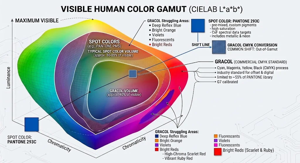
Diagram of the visible human color gamut showing spot colors, GRACOL CMYK, and shift lines with axes labeled luminance and chromaticity. Infographic illustrating the visible color space as a 3D color volume with spot colors, CMYK ranges, and Pantone references.Quick Reliable Printing (QRP)Quick Reliable Printing (QRP)

Theoretical Science vs. Pressroom Reality

Compounding the guide and conversion issues, Pantone’s digital ink formulations occasionally lean into “homeopathic-level” chemistry—specifying fractional ink mixing percentages (such as 0.10% or even 0.06% of an ingredient like black ink) to mathematically hit a theoretical target in a lab setting. On a real-world press floor or in an ink-mixing kitchen, accurately dispensing and evenly distributing fractions of a gram of pigment across a standard batch of spot ink is nearly impossible. In practice, these hyper-theoretical formulas lead to batch-to-batch inconsistencies that drive press operators crazy.

The Prepress Challenge: Bridging Brand Expectations to the Press

When managing spot colors and their CMYK equivalents in a modern prepress workflow (whether driving an offset line, flexo press, or inkjet presses), you can’t blindly trust incoming files. You have to implement rigorous quality gates:
  • Rely on Spectral CxF Definitions: Move away from ambiguous CMYK or RGB approximations. Use modern Color Exchange Format (CxF) data structures that capture the color’s full reflectance spectrum, ensuring your Digital Front End (DFE) knows precisely what spectral target to aim for.

  • Manage Substrate Realities: A color printed on bright, smooth coated stock will reflect light very differently than when printed on porous, unbleached kraft or textured art paper. Prepress operators must simulate or communicate how substrate color shifts impact the final visual result.

  • Establish Realistic ΔE Tolerances: Do not let subjective visual disputes derail a run. Set clear, measurable CIEDE2000 (ΔE) numerical tolerances with your brand clients ahead of time (e.g., aiming to keep critical brand assets under ΔE 1.5 to 2.0) and verify them on the press sheet using a calibrated spectrophotometer.

Spot colors and their CMYK bridges are powerful tools for brand identity, but only when you treat them with technical rigor rather than blind faith in physical swatch books. By understanding that every formula is merely a localized snapshot, you can bridge the gap between designer expectations and what actually rolls off the production line.

How are you currently handling color communication and sign-offs when transitioning a brand’s spot colors over to standard CMYK process printing?

Share This Story, Choose Your Platform!

Categories: Color Management|Published On: September 8, 2026|By |Last Updated: September 25, 2026|
Postcard Printing & MailingQuick Reliable Printing (QRP)

Commercial Printing

We put ink on almost anything. From business cards and posters to brochures and postcards, we offer a wide range of printing services tailored to your needs.

Custom Roll Labels & StickersQuick Reliable Printing (QRP)

Labels & Stickers

No matter what shape, size, or type of label or sticker is needed, the options are endless. We produce roll labels, cut-to-size stickers, sheet labels, and more.

Custom Yard Signs & BannersQuick Reliable Printing (QRP)

Signs & Banners

Signs, Banners, and posters are great for announcing upcoming product releases, special occasions, clearance sales, and other marketing messages.

Direct Mail Marketing ServicesQuick Reliable Printing (QRP)

Direct Mail Marketing

Direct Marketing gives you the power to market directly to your specific audience, quickly and effectively conveying your message.

Promotional ProductsQuick Reliable Printing (QRP)

Promotional Products

You’ll find the right promotional products for everyone in your organization to help you get noticed and make an impression.

Online PrintingQuick Reliable Printing (QRP)

Online Ordering

Let us take the workload out of your hands while maintaining your branding vision by fast, cost-efficiently ordering and fulfilling printed materials.

Graphic DesignQuick Reliable Printing (QRP)

Creative Services

Let one of our expert graphic designers help you achieve your vision with custom designs you’ll be proud to show off.

Spiral BindingQuick Reliable Printing (QRP)

Bindery & Finishing

Our in-house bindery and finishing options provide the necessary frame and finish to turn your printing project into a polished marketing product.

Warehousing ServicesQuick Reliable Printing (QRP)

Warehousing

We can securely and efficiently manage, store, assemble, kit, package, and ship your printed material.

USB Jump Drive DuplicationQuick Reliable Printing (QRP)

Media Duplication

Branding portable media with your logo or other marketing message is an excellent way to get your brand noticed.