The Pantone Revelation: What Pantone Is, What It Isn’t, and Why Brand Color is Broken
The Pantone Revelation: What Pantone Is, What It Isn’t, and Why Brand Color is Broken
The Pantone Revelation: What Guides Are (and What They Aren’t)
For decades, Pantone has been the undisputed authority on spot colors. Designers flip through physical swatch books, find a crisp hue, and specify it for production. However, official Pantone guidance reveals a surprising reality that catches many print buyers and designers off guard: physical Pantone Guides aren’t what most people think they are.
What Pantone Guides ARE:
-
Useful in design for color inspiration: They provide a tactile palette to spark creative direction during the initial conceptual phase.
-
A quick reference for color visualization: They offer a fast way to preview how a general hue family looks on paper loosely.
-
Recognized globally for color communication: They give the supply chain a shared numerical naming convention so everyone talks about the same named hue.
What Pantone Guides ARE NOT:
-
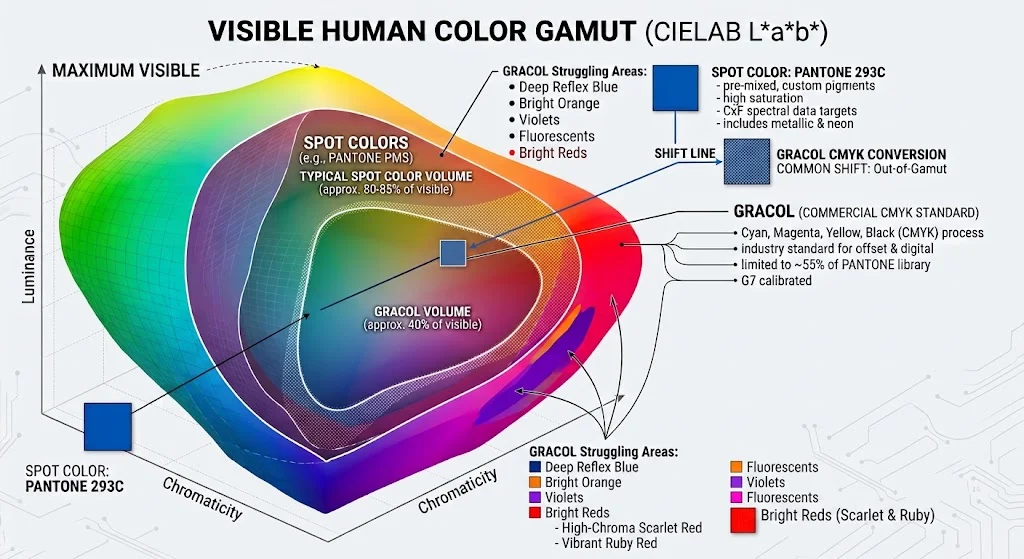
ARE NOT: The master standard. The physical ink swatch or formula in your hand is not an absolute law. The exact same ink formulation will look completely different on every press, under different press calibrations, on alternate paper stocks, and across fluctuating lighting environments.
-
ARE NOT: Constant in their Delta E (ΔE) values. Physical guides age, fade, and vary significantly from print run to print run, meaning their actual colorimetric values drift away from their intended math.
-
ARE NOT: Consistent with each other. If you compare an older fan guide to a freshly minted one, you will often find noticeable color discrepancies. If you compare ten different guides, you will get ten different visual results.
Beyond Spot Colors: The CMYK Translation Challenge and Color Bridge
-
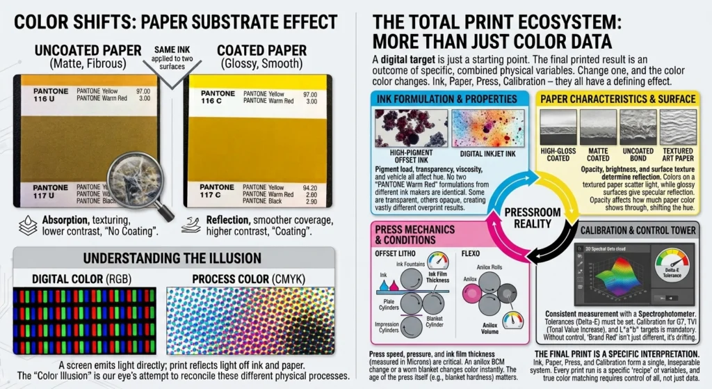
The Gamut Limitation: Pantone spot inks utilize a wide range of pure base pigments. When you convert a vibrant Pantone spot color into CMYK, you are trying to squeeze a large color gamut into a much smaller one. Bright oranges, reds, greens, and purples often fall entirely outside the CMYK gamut, meaning process printing will inevitably yield a duller result than solid colors.
-
The Role of the Pantone Color Bridge: Because software auto-conversions can be wildly inaccurate, tools like the Pantone Color Bridge are critical. A Color Bridge guide places a Pantone spot color next to its closest CMYK process simulation, along with the recommended CMYK percentage values. But again, remember that those initial values are not law.
-
The Reality of CMYK Values: Like spot formulas, the CMYK values in a Color Bridge are also snapshots. They show how that specific build appeared under ideal laboratory conditions on that particular stock, with that specific press, with that calibration, on that day, under that lighting. If your substrate changes from coated to uncoated paper, those CMYK values will shift dramatically.
Theoretical Science vs. Pressroom Reality
The Prepress Challenge: Bridging Brand Expectations to the Press
-
Rely on Spectral CxF Definitions: Move away from ambiguous CMYK or RGB approximations. Use modern Color Exchange Format (CxF) data structures that capture the color’s full reflectance spectrum, ensuring your Digital Front End (DFE) knows precisely what spectral target to aim for.
-
Manage Substrate Realities: A color printed on bright, smooth coated stock will reflect light very differently than when printed on porous, unbleached kraft or textured art paper. Prepress operators must simulate or communicate how substrate color shifts impact the final visual result.
-
Establish Realistic ΔE Tolerances: Do not let subjective visual disputes derail a run. Set clear, measurable CIEDE2000 (ΔE) numerical tolerances with your brand clients ahead of time (e.g., aiming to keep critical brand assets under ΔE 1.5 to 2.0) and verify them on the press sheet using a calibrated spectrophotometer.
Spot colors and their CMYK bridges are powerful tools for brand identity, but only when you treat them with technical rigor rather than blind faith in physical swatch books. By understanding that every formula is merely a localized snapshot, you can bridge the gap between designer expectations and what actually rolls off the production line.