Making Branded Notepads That Get Used (Not Tossed)
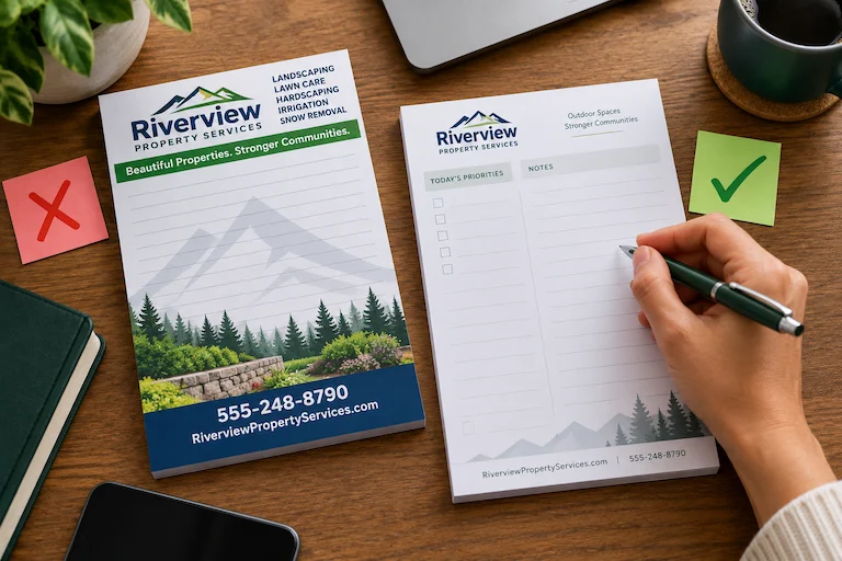
Making Branded Notepads That Get Used (Not Tossed)
A branded notepad actually has two customers.
The first is your own business and its desire to increase visibility. The second is the person receiving it, who wants somewhere convenient to write.
A good branded notepad design respects both.
Too much advertising can make the page frustrating to use. Too little branding can leave people wondering where the pad came from. The goal isn’t to split the page evenly between marketing and writing space. It’s to make every design decision support the way the notepad will actually be used.
Start With What Someone Will Do With It
Before deciding where the logo goes, picture the notepad in someone’s hands.
- Will it sit beside a phone for quick messages?
- Travel into meetings?
- Hold daily task lists?
- Be handed out during a seminar?
- Sit at a service counter?
A meeting pad might benefit from plenty of open writing space. A task-oriented pad could include checkboxes or designated areas for priorities. A pad intended for quick messages might organize information differently.
There isn’t one ideal layout for every custom notepad because people don’t use every notepad the same way.
Start with the job. Then design the page around it.
Give Your Brand a Job, Too
Once you know what the recipient needs, decide what your business needs the pad to communicate.
Maybe recognition is enough. Your logo and brand colors clearly identify the source.
In another situation, a website or phone number may help someone reconnect with you. A short message could make sense if it adds context.
The temptation is to include everything because the space is available. But a notepad doesn’t need to become a miniature brochure.
Choose the information that matters most, and give it room to work.
Don’t Make People Write Around Your Marketing
Picture someone halfway through a meeting who needs another line for an important note, but a giant logo is occupying the bottom third of the page.
That’s a branding decision they will notice for the wrong reason.
Logo placement, margins, headers, footers, typography, lines, and open space all influence how comfortable the page feels to use. Strong branding doesn’t require dominating the writing area.
In fact, the whole page can reinforce your identity through color, type, organization, and thoughtful placement rather than one oversized element.
A simple test can help: Could someone use this page naturally without constantly working around the marketing?
Remember That a Notepad Is a Physical Product
A design can look great on a monitor and still need another question answered:
What will this be like to use?
Size matters. So does how much room someone has to write, how the pad will be handled, and how it fits into the setting where you expect it to live.
The detailed paper and production decisions can come later. At the design stage, the important thing is remembering that you’re creating an object people will hold, write on, move around, and potentially return to many times.
Try the Two-Sided Test
Before sending your custom notepad design to print, look at it from both perspectives.
- For the recipient: Is this easy and pleasant to use?
- For your business: Is it clear who provided it, and can someone reconnect with you if needed?
If one side wins at the other’s expense, the design probably needs another look.
Make Every Sheet Work for Both Sides
The best place to begin isn’t, “How big should our logo be?”
Start with three questions instead:
- Who will receive this?
- How will they use it?
- What do we want them to remember about us?
Bring those answers to us. We can help you turn the idea into a branded notepad that gives people useful writing space while keeping your business recognizable.